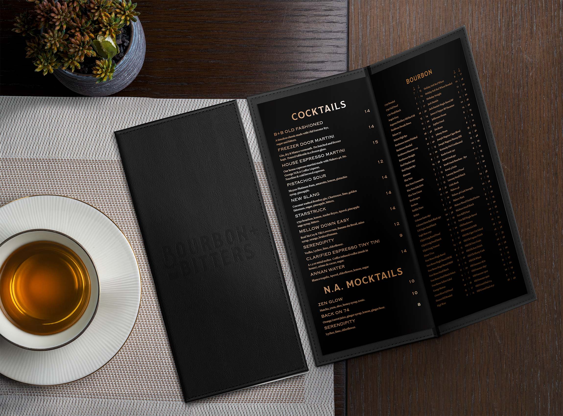
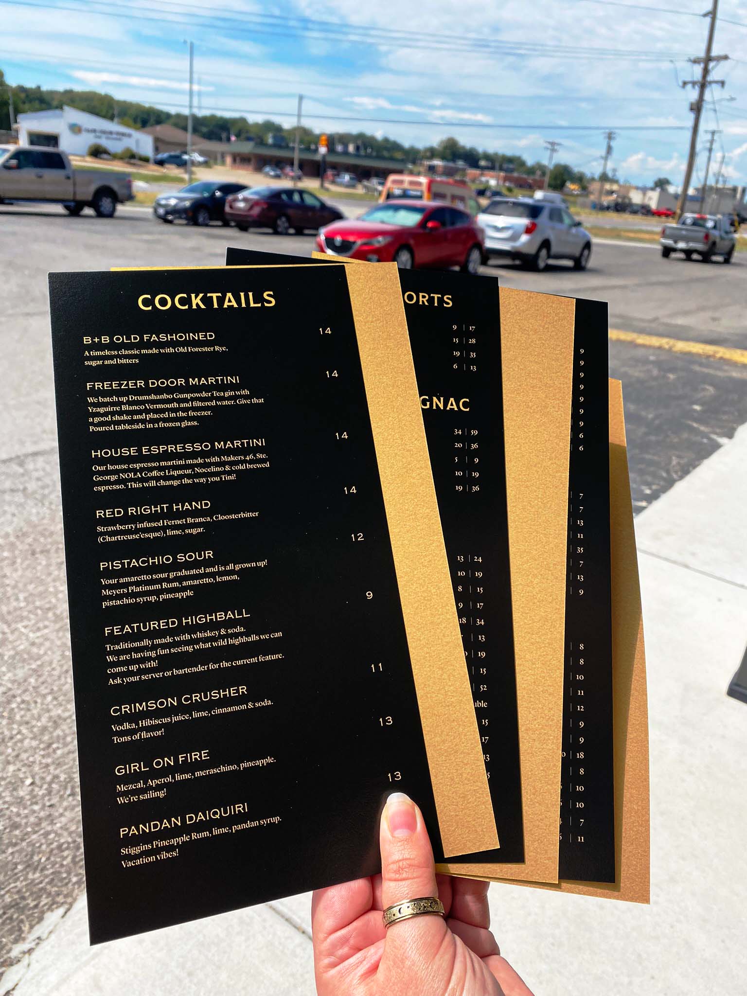
I had the unique opportunity to meet personally with the owner of Bourbon + Bitters before doing their menus. We used their existing menu as a starting point, but I saw an opportunity to take it to the next level and use some specialty paper we'd been experimenting with. Next time your're in Bourbon + Bitters take note of the shimmering metalic gold while you're admiring the typesetting.
Category
Project Type
Employment - TPC
Client
Bourbon + Bitters
Year
2024-
Software
Adobe Illustrator